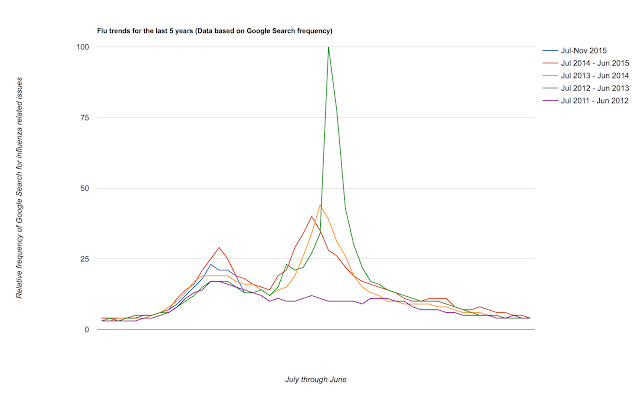
Much has been made of using Google Search data to predict health events, especially flu outbreaks. Here's how this flu season is proceeding compared to prior years:
The blue line represents the influenza trend for 2015, and so far it is the second highest year of the last 5 years. Note that the highest year was the 2012-2013 season which actually started off quite slow.
The blue line represents the influenza trend for 2015, and so far it is the second highest year of the last 5 years. Note that the highest year was the 2012-2013 season which actually started off quite slow.

Comments